AIRTEL XSTREAM Play · Web Responsive
AIRTEL XSTREAM Play · Web Responsive
AIRTEL XSTREAM Play · Web Responsive
Because no one waits for
TV anymore.
Because no one waits for
TV anymore.
Because no one waits for
TV anymore.
We shifted Xstream from a channel-first experience to a content-first platform built for modern viewing behavior.
We shifted Xstream from a channel-first experience to a content-first platform built for modern viewing behavior.
We shifted Xstream from a channel-first experience to a content-first platform built for modern viewing behavior.
5M+
5M+
paid subscribers
passes sold
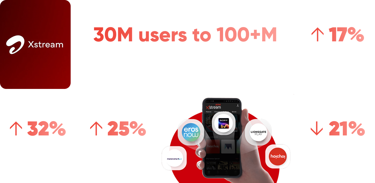
100M+
100M+
monthly users
net upsell revenue
↑ 32%
↑ 32%
content discovery
content discovery


Product
Airtel Xstream Play Web
Airtel Xstream Play Web
Scope
Web responsive
Web responsive
Focus
From channel-first to content-first
From channel-first to content-first
Role
Sr. Product Designer (Airtel)
Sr. Product Designer (Airtel)
Impact made
Impact made
100M+ monthly users
100M+ monthly users
↑ 32% in content discovery
↑ 32% in content discovery
5M+ monthly paid users
5M+ monthly paid users
Airtel Xstream Play Web
Airtel Xstream Play Web
Airtel Xstream Play Web
Fixing how people actually get to what they want to watch
Fixing how people actually get to what they want to watch
Fixing how people actually get to what they want to watch
The Setup
The Setup
The Setup
Good content. Friction in getting to it.
Good content. Friction in getting to it.
Good content. Friction in getting to it.
Airtel Xstream offered a wide catalog across TV, movies, and regional content, but the experience didn’t keep up with how people actually consumed it.
Users often opened the app with clear intent, but getting to that content required navigating multiple layers, interpreting unclear categories, and making unnecessary decisions along the way.
The issue wasn’t lack of content or features.
It was the effort required to access them.
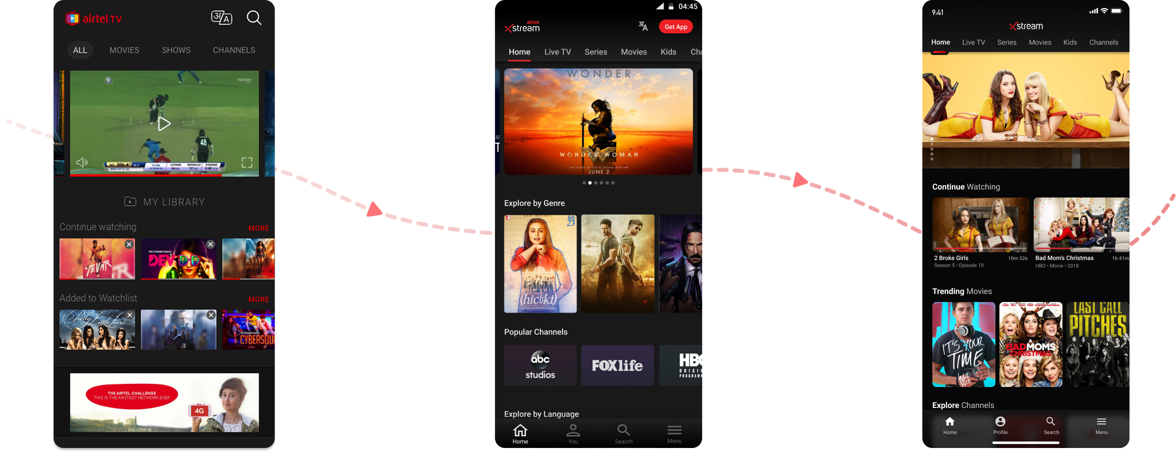
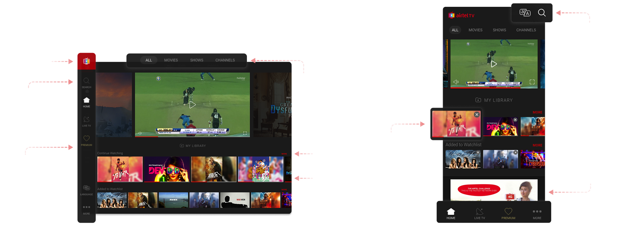
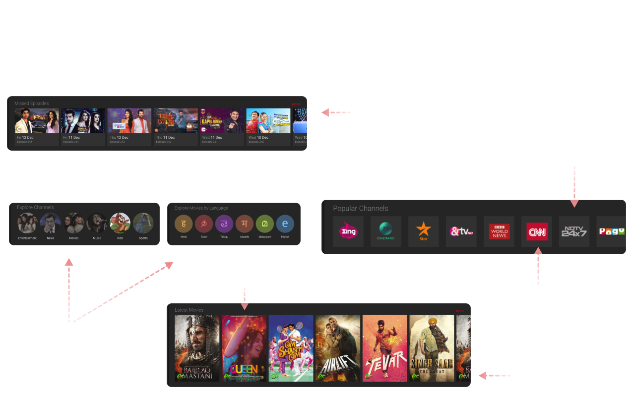
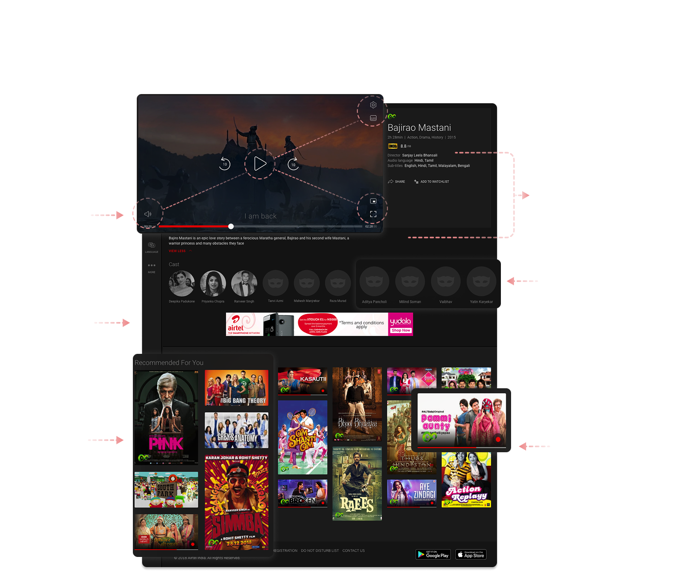
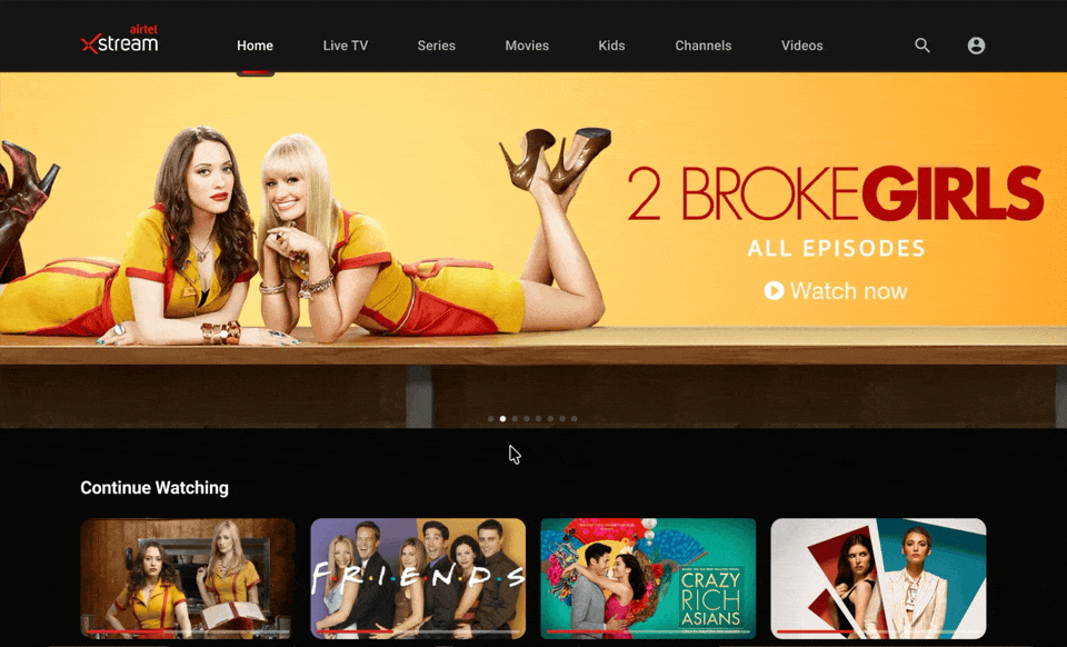
OLD WEB EXPERIENCE
OLD WEB EXPERIENCE
OLD WEB EXPERIENCE
How might we
How might we
How might we
From scheduled viewing to on-demand intent
From scheduled viewing to on-demand intent
From scheduled viewing to on-demand intent
How might we help Xstream adapt to users shifting from broadcast to binge consumption?
How might we help Xstream adapt to users shifting from broadcast to binge consumption?
How might we help Xstream adapt to users shifting from broadcast to binge consumption?
User behavior had already moved ahead of the product.
Viewing was no longer passive or schedule-driven. It was intentional, fast, and often session-based. Users expected to continue where they left off, find relevant content quickly, and move seamlessly between browsing and playback.
To support this shift, the experience needed to:
Reduce dependency on traditional TV-style navigation
Support quick re-entry into content (resume, continue watching)
Handle diverse content types and languages without overwhelming users
Scale with increasing content partnerships and categories
This wasn’t just a redesign. It was restructuring the product around intent.
INSIGHT
INSIGHT
INSIGHT
Users don’t browse. They execute.
Users don’t browse. They execute.
Users don’t browse. They execute.
Mapping the journey revealed a pattern. Most sessions started with a clear goal, not exploration.
Users typically fell into one of three behaviors:
Returning to continue something they had already started
Searching for a known title
Scanning briefly before committing quickly
The current experience treated all users as explorers, which added friction for those who weren’t.
Key shift: Design for intent first, discovery second.

FRICTION
FRICTION
FRICTION
Where the experience slowed users down
Where the experience slowed users down
Where the experience slowed users down
The problems weren’t isolated. They were structural.
Navigation: Content categories overlapped and lacked clear hierarchy
Flow: Too many steps between landing and playback
Recovery: Error states and unavailable content created dead ends
Language: Labels and copy didn’t always guide action clearly
Each issue added a small delay. Together, they broke momentum.
APPROACH
APPROACH
APPROACH
Designing for flow, not screens
Designing for flow, not screens
Designing for flow, not screens
The focus shifted from redesigning individual surfaces to restructuring how users moved through the product.
Instead of asking “what should this screen do?”, the question became:
“what is the fastest path from intent to playback?”
This led to three guiding principles:
Reduce decisions → remove unnecessary choices and ambiguity
Shorten paths → minimize steps between entry and action
Maintain momentum → avoid dead ends and interruptions
HOMEPAGE
HOMEPAGE
HOMEPAGE
DETAIL PAGE
DETAIL PAGE
DETAIL PAGE
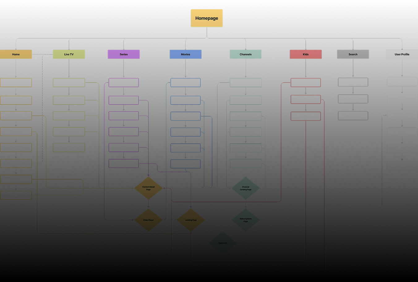
System
Restructuring the experience around intent
Restructuring the experience around intent
Restructuring the experience around intent
The redesigned system focused on clarity, predictability, and speed.
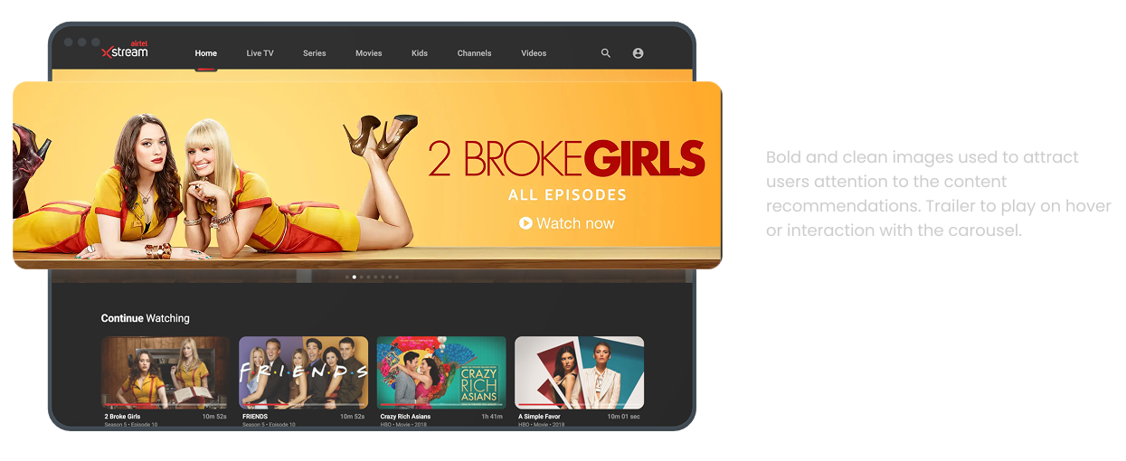
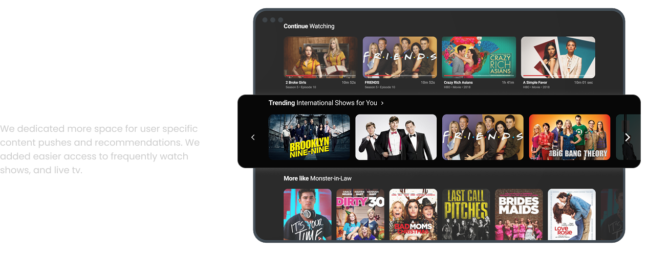
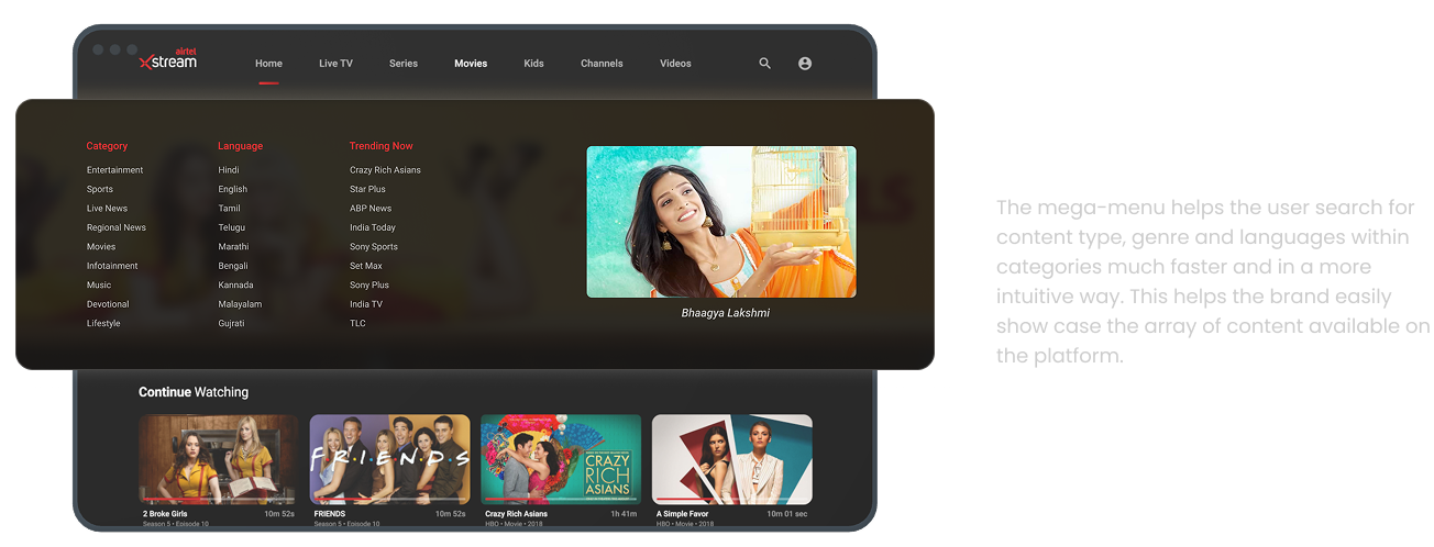
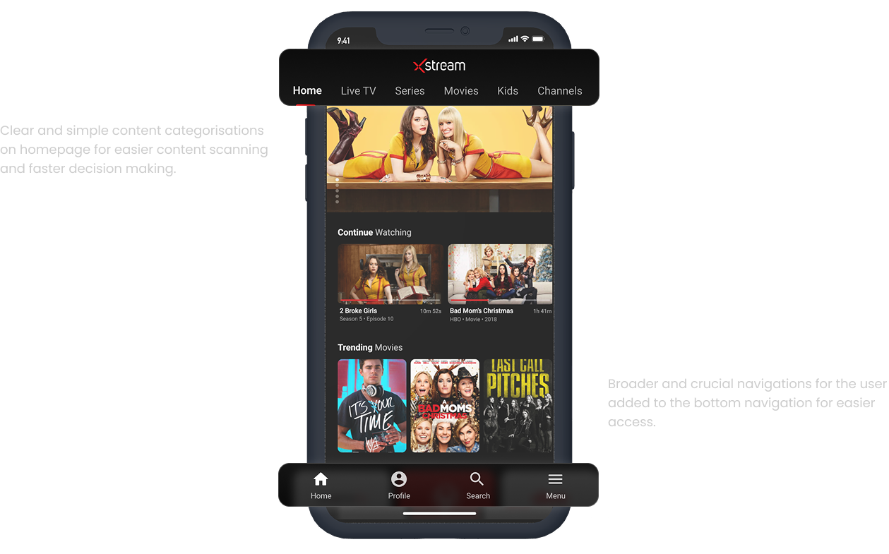
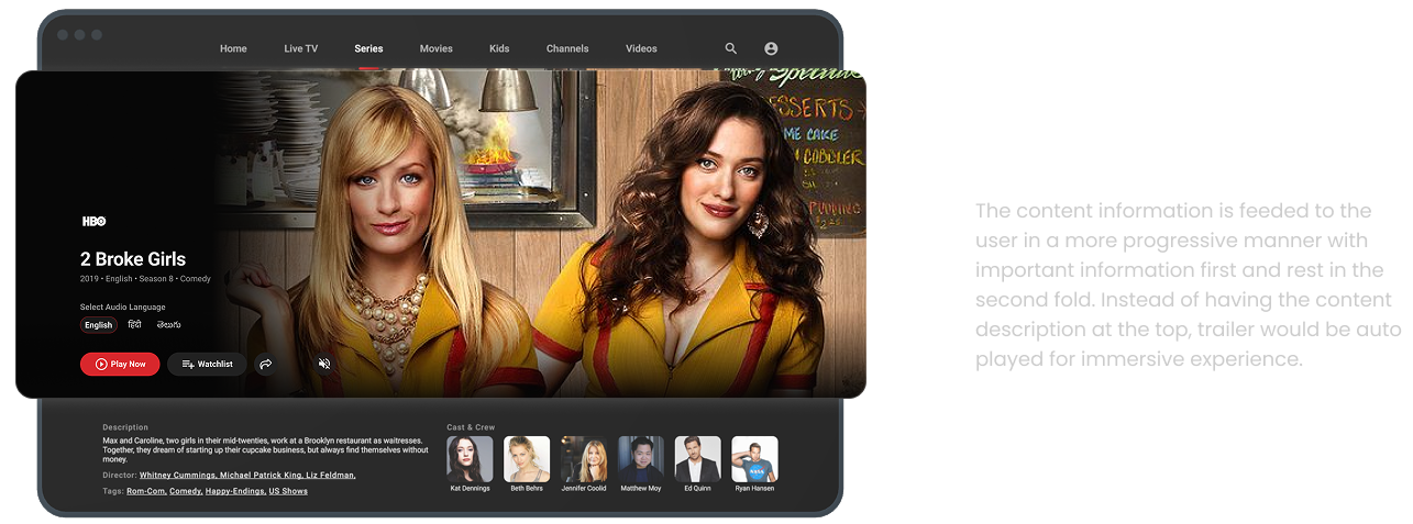
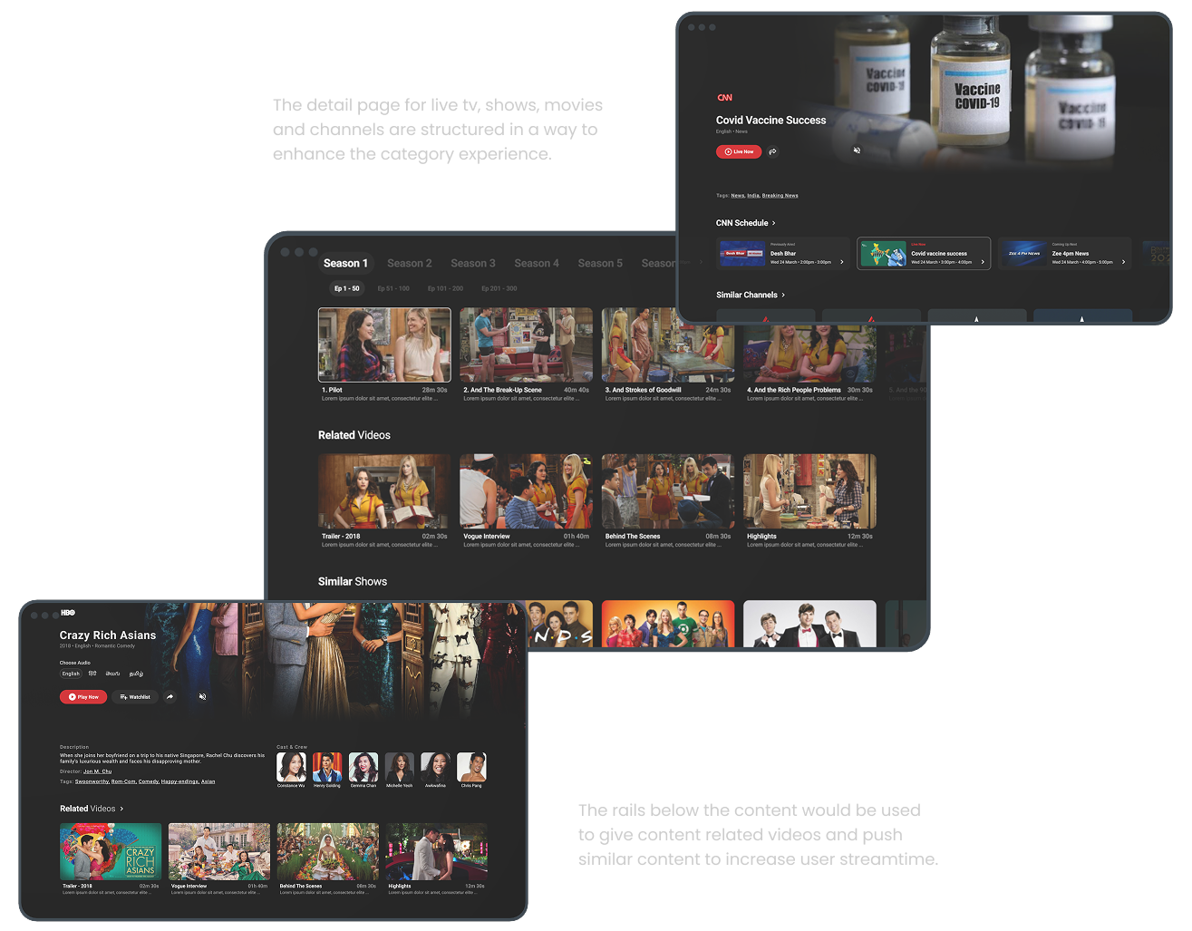
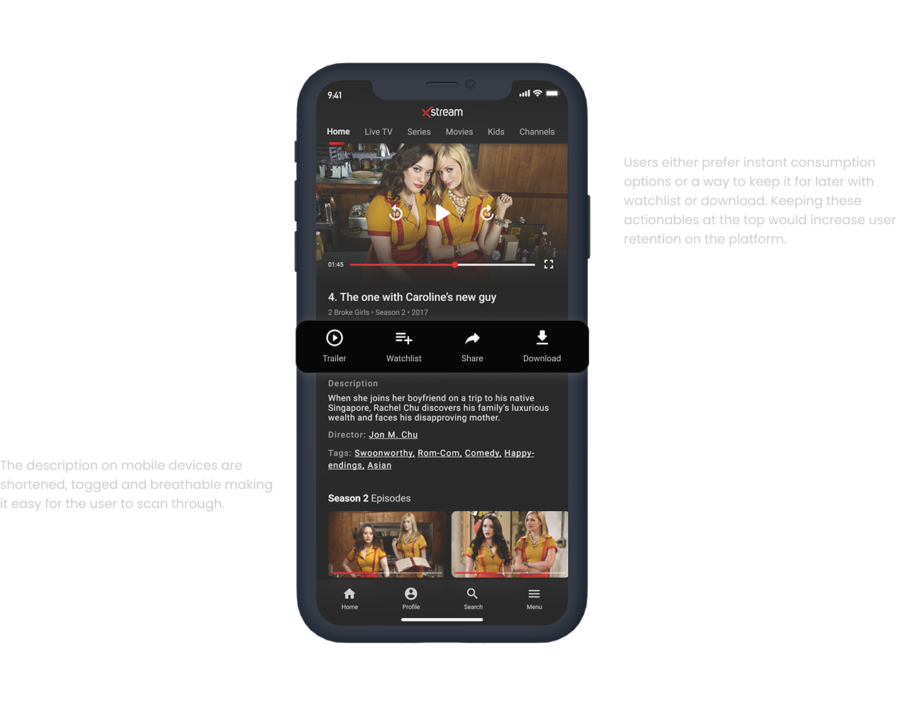
Navigation was simplified to establish a clearer content hierarchy. Entry points like “Continue Watching” and personalized rows were prioritized to support quick access. Content grouping was rethought to reduce overlap and confusion, especially across languages and formats.
Error handling was redesigned to guide users toward alternative content instead of blocking them. Microcopy was refined to support decision-making and reduce hesitation.
Rather than adding new features, the system removed friction across existing ones.
The redesigned system focused on clarity, predictability, and speed.
Navigation was simplified to establish a clearer content hierarchy. Entry points like “Continue Watching” and personalized rows were prioritized to support quick access. Content grouping was rethought to reduce overlap and confusion, especially across languages and formats.
Error handling was redesigned to guide users toward alternative content instead of blocking them. Microcopy was refined to support decision-making and reduce hesitation.
Rather than adding new features, the system removed friction across existing ones.
Impact
Faster decisions. Smoother sessions.
Faster decisions. Smoother sessions.
Faster decisions. Smoother sessions.
The redesigned experience improved how quickly users could move from entry to playback, reduced hesitation in navigation, and created a more predictable interaction model across the platform.
The product felt lighter, more responsive, and aligned with user expectations.
No new complexity.
Just less resistance.
TAKEAWAYS
TAKEAWAYS
TAKEAWAYS
Clarity scales. Complexity doesn’t.
Clarity scales. Complexity doesn’t.
Clarity scales. Complexity doesn’t.
This project reshaped how I think about designing for content platforms.
Users don’t need more options, they need clearer paths. Navigation isn’t a layer on top of the experience, it defines it. And the most impactful improvements often come from removing friction, not adding features.
This project reshaped how I think about designing for content platforms.
Users don’t need more options, they need clearer paths. Navigation isn’t a layer on top of the experience, it defines it. And the most impactful improvements often come from removing friction, not adding features.
This project reshaped how I think about designing for content platforms.
Users don’t need more options, they need clearer paths. Navigation isn’t a layer on top of the experience, it defines it. And the most impactful improvements often come from removing friction, not adding features.
Big takeaway: The best experiences don’t draw attention to themselves. They just work.
Big takeaway: The best experiences don’t draw attention to themselves. They just work.
Big takeaway: The best experiences don’t draw attention to themselves. They just work.
More Projects
More Projects
More Projects
Looks like you'd like to see more
Looks like you'd like to see more
Looks like you'd like to see more


Are you still watching? Get in touch
© 2026 Saumya Ghai
Are you still watching? Get in touch
© 2026 Saumya Ghai
Are you still watching? Get in touch
© 2026 Saumya Ghai
Are you still watching? Get in touch
© 2026 Saumya Ghai